Modern kitchen makeover
What to do when you grow tired of your old, existing kitchen? Get in touch with Abbeyfeale Interiors or book a premium package directly through our website HERE.
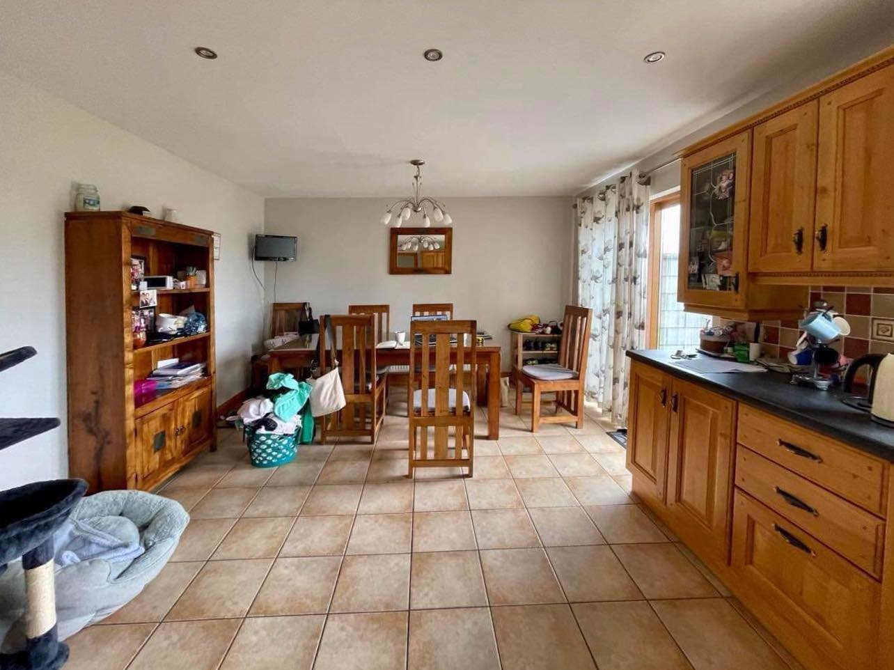
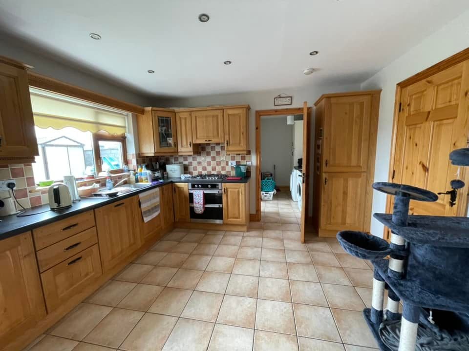
For the last few years, our client was busy raising a family. There were more important things to worry about, like dropping off children for horse riding lessons, than decorating a kitchen. Even though the kitchen was in great condition, it wasn’t very functional. Dining chairs were so heavy that children couldn’t pull them out themselves, or they struggled to do so. The fridge was too small, there was no larder, and the whole space felt very dark and dated to the point no one ever wanted to spend any time there. My client was here all alone cooking dinners or organizing laundry. We needed to change that and soon.
The key requests for this makeover:
- It needed to be budget-friendly,
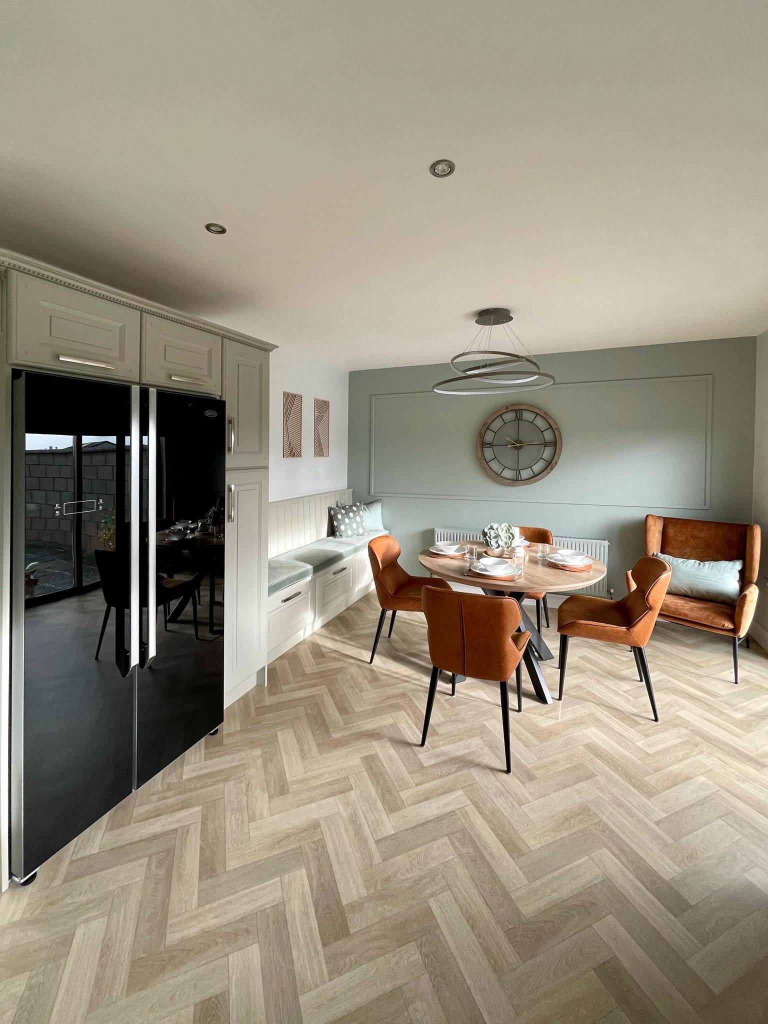
- American style fridge-freezer,
- Larder,
- We couldn’t lose any storage,
- Comfortable dining chairs,
- Modernize the whole space and make it cozy and inviting.
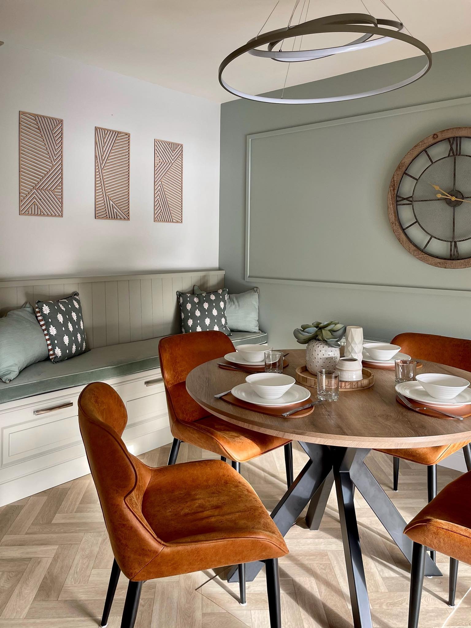
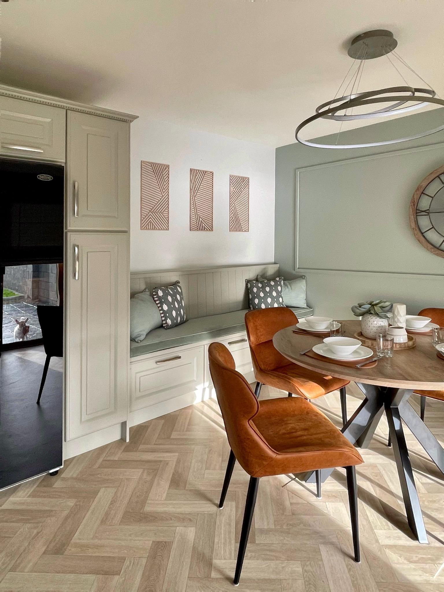
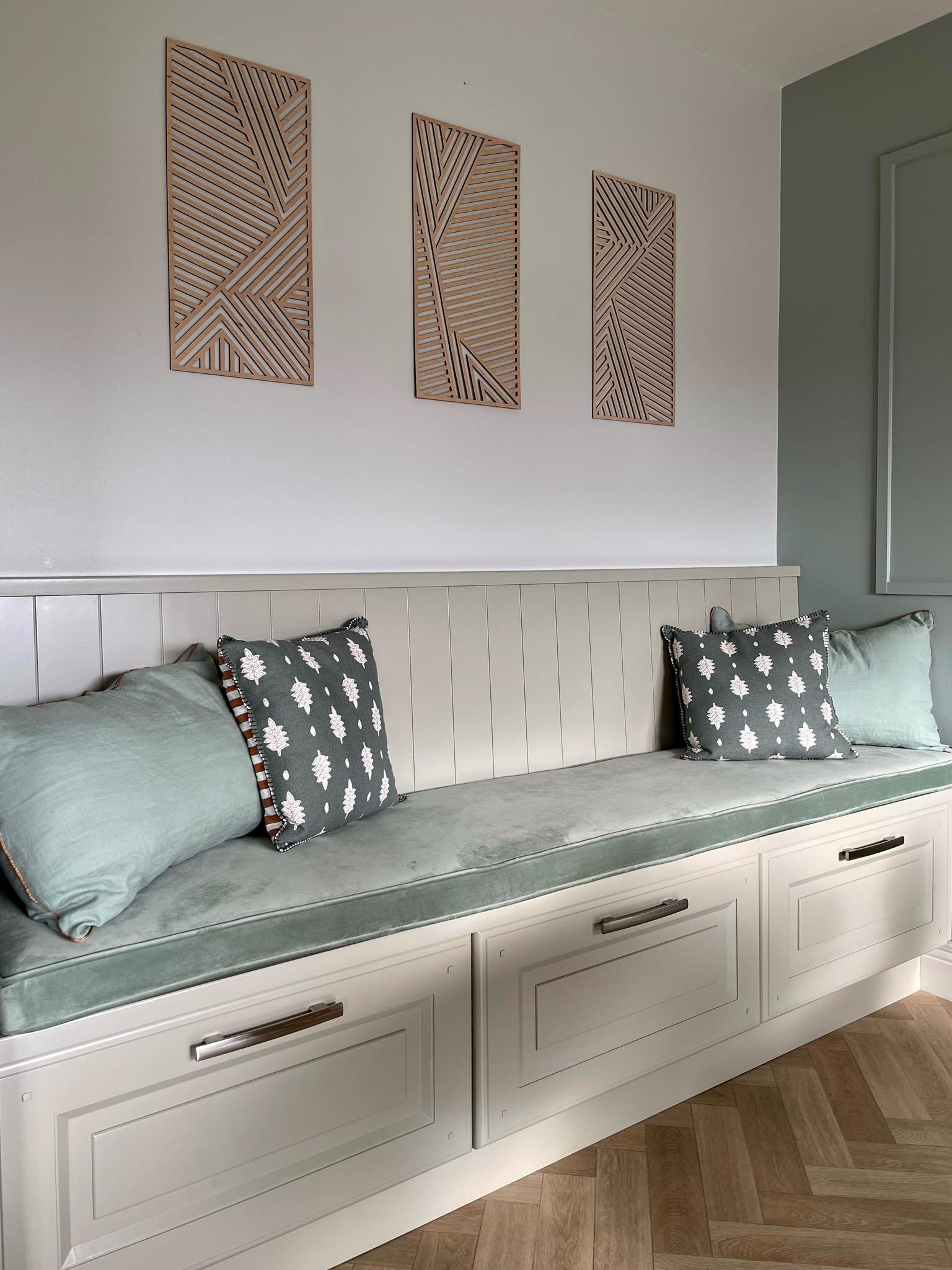
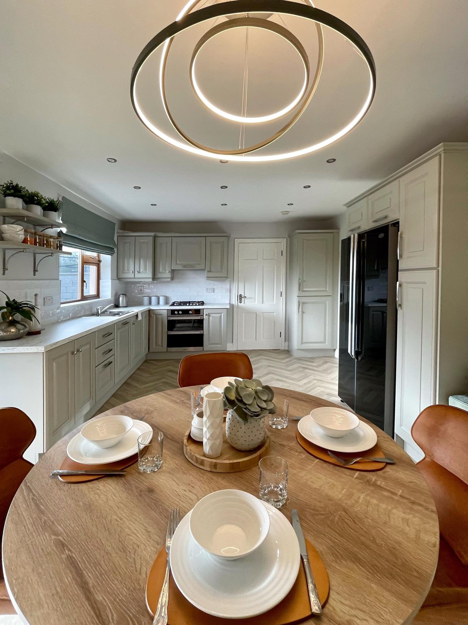
The first thing that I concentrated my efforts on was ways to improve the layout of the kitchen and to ensure that we can fit a large fridge-freezer in it. I toyed with the idea of adding a breakfast bar, but I quickly decided that it wouldn’t help with anything. We had the whole width of the wall on the opposite side of the kitchen that we weren’t using, and it seemed like a waste not to use it. And so, the idea of the dining bench, spice rack, and built-in fridge was born.
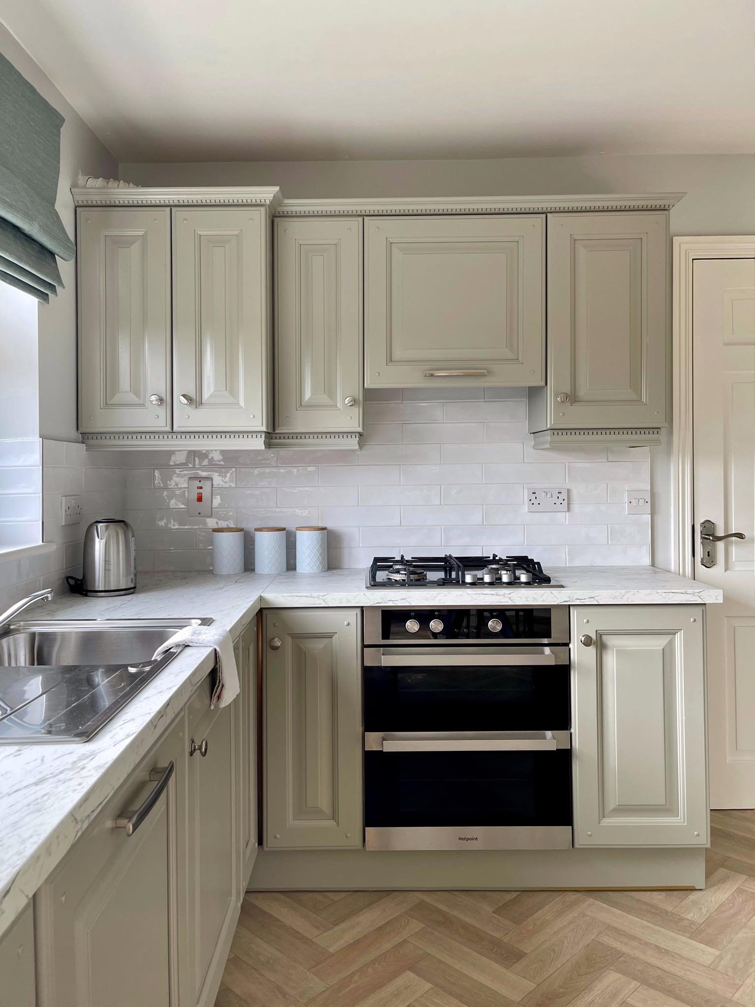
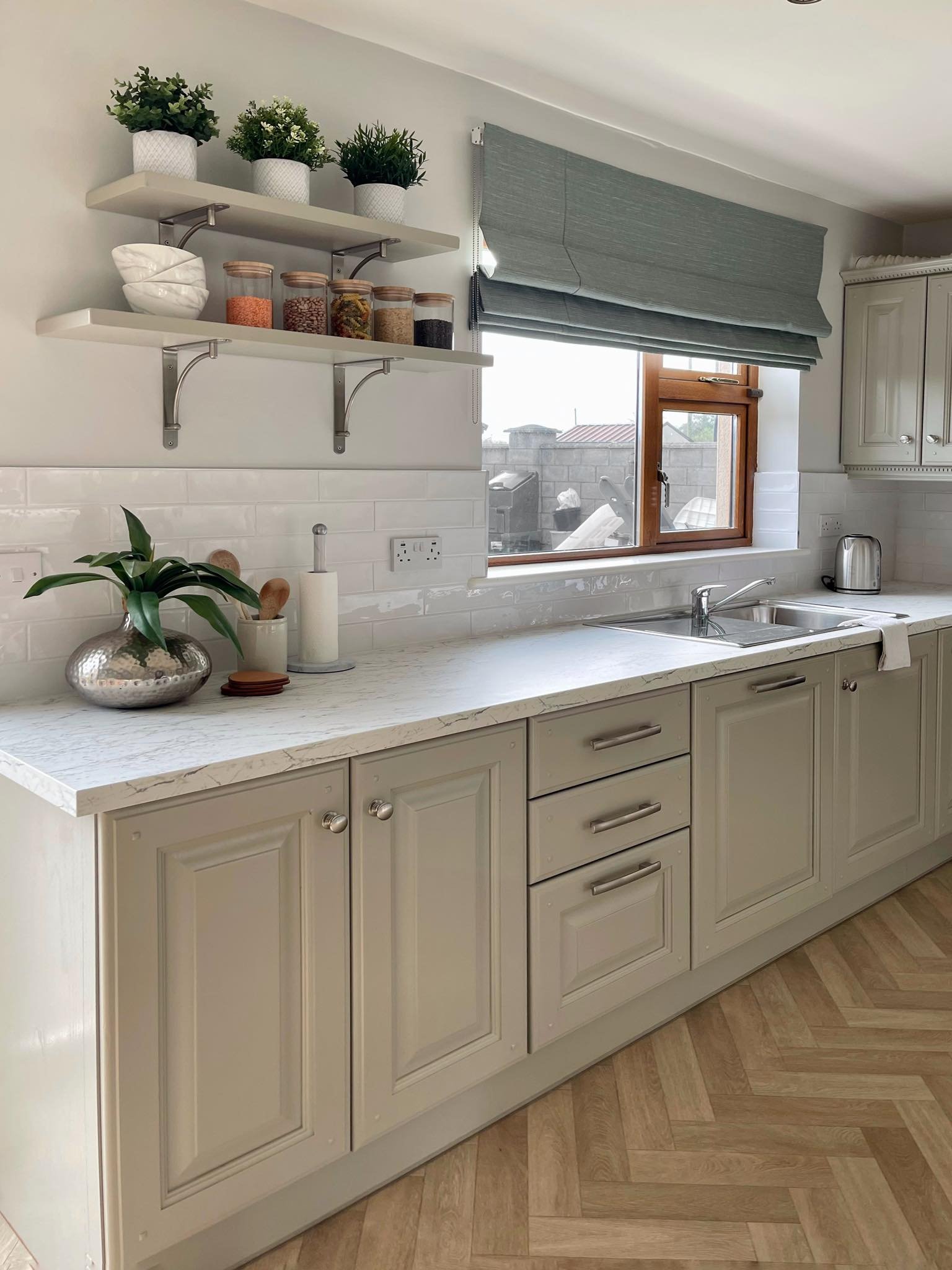
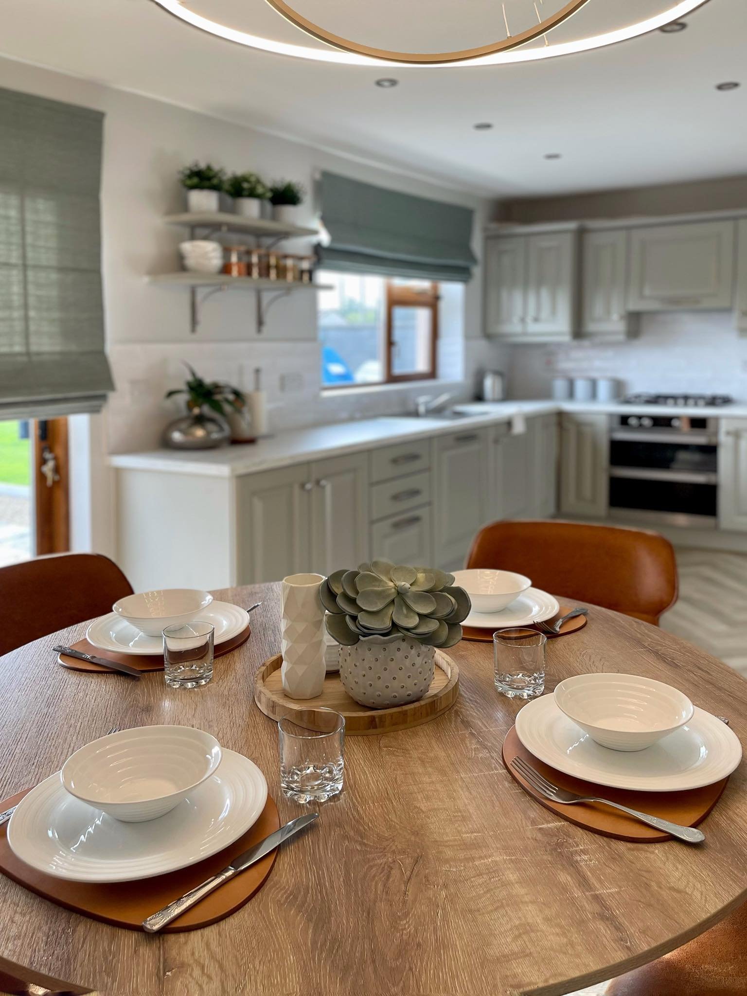
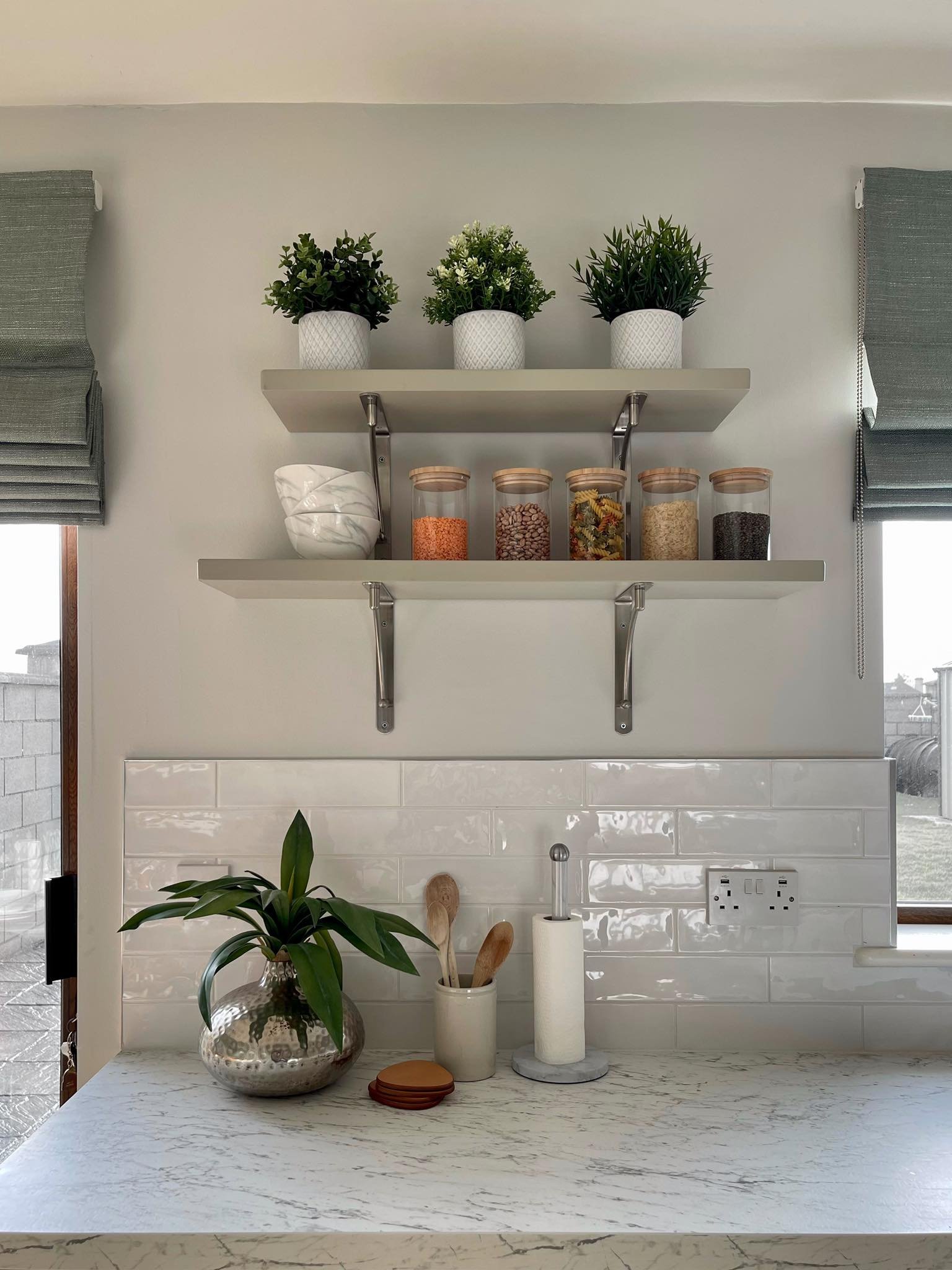
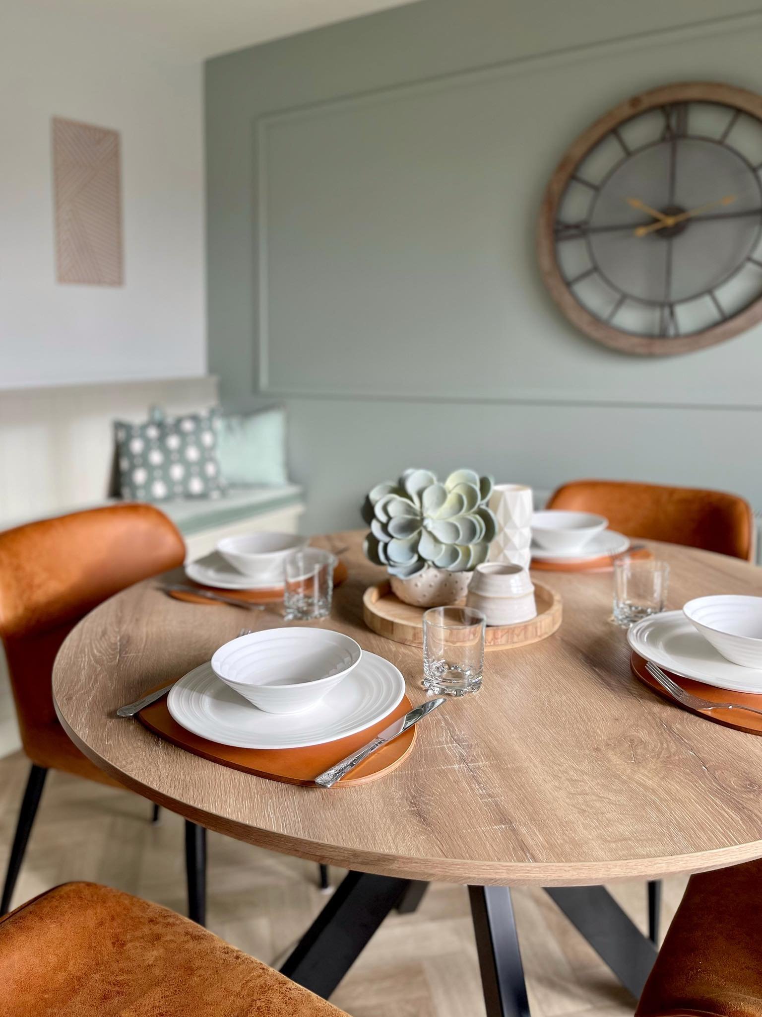
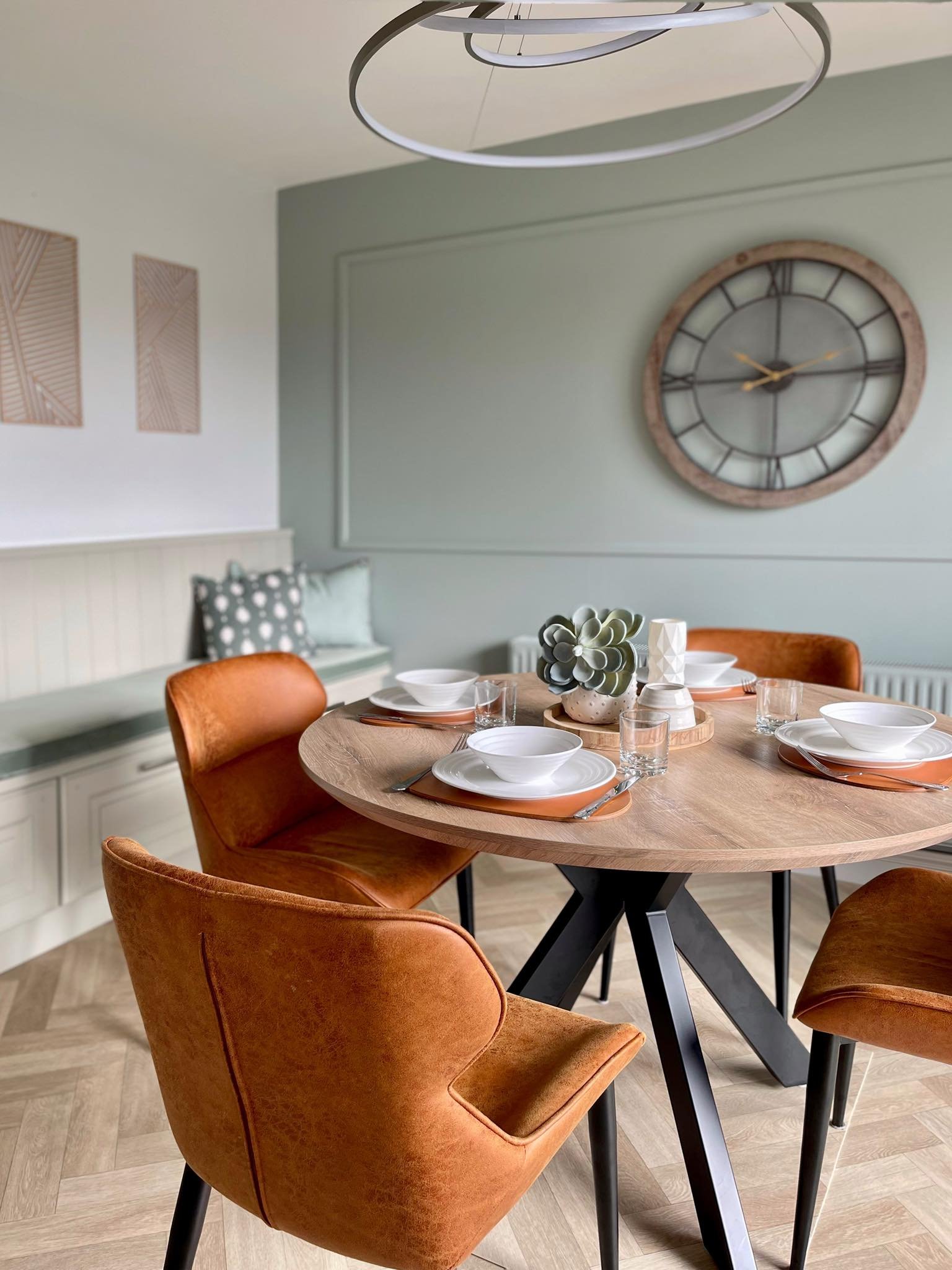
I decided to keep things simple as I know all too well how hard it is to keep things organized when you live under the same roof as busy twins. Yes, my client also has twins! Minimal décor, easy-to-keep chairs, and all other surfaces to make life as easy and enjoyable as possible. Using a round dining table, a wall clock and a circular ceiling lamp was a strategic move. Here’s why: everything in the kitchen is bulky and square with a lot of edges and it needs softening up. Using round furnishings and accessories helps with that. My client requested a cozy kitchen and the textures are crucially important to achieve that. So here we have gorgeous roman blinds on both windows, upholstered dining chairs, and an armchair that is so comfortable that once you sit on it you don’t want to get up. Apparently, my client’s family spends a lot of time here now so it all worked.
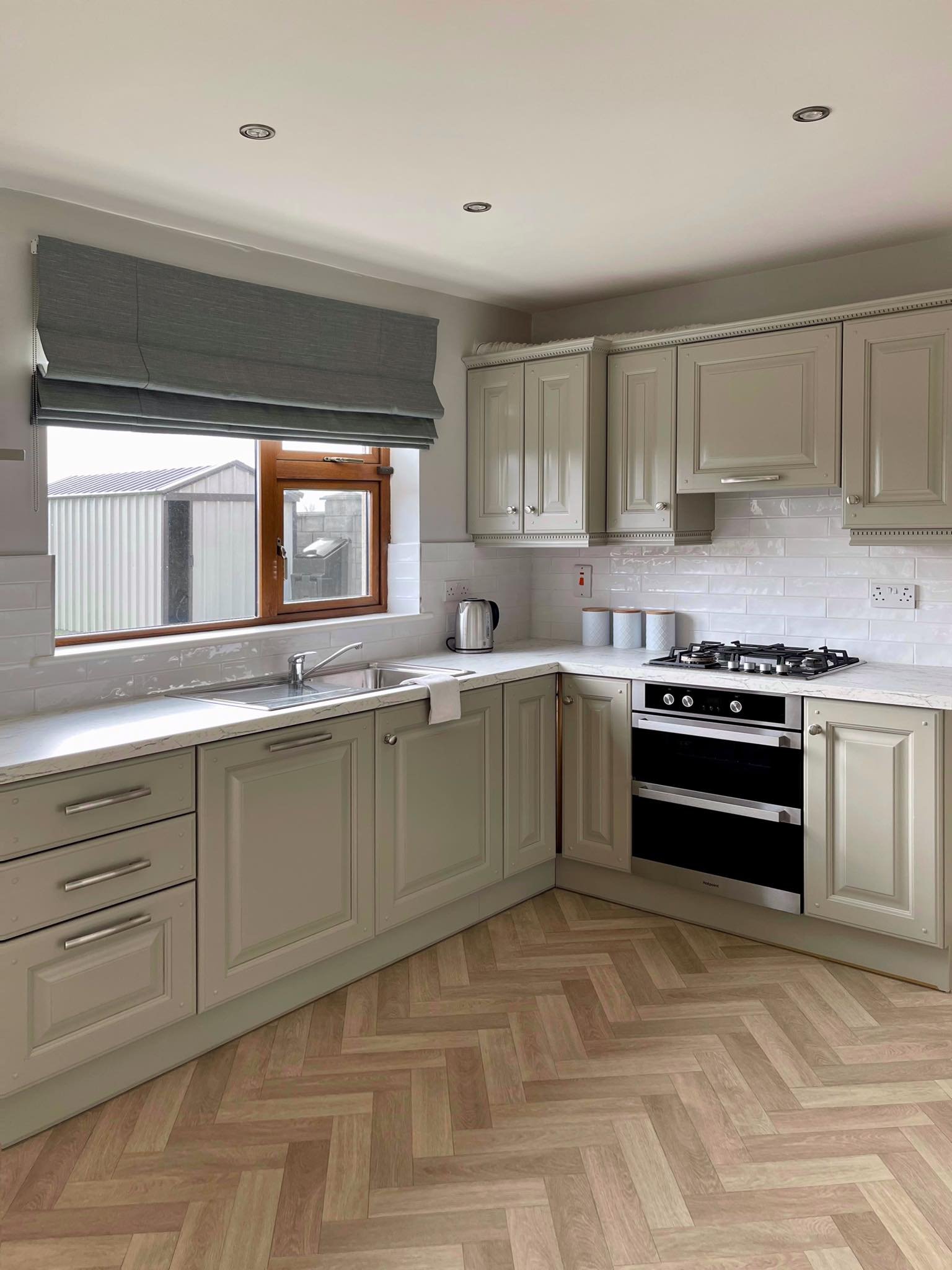
One of the biggest problems we had to figure out was what to do with the tiled floor. How to update the flooring without having a major reno or without spending a lot of money? My client decided that she wants to use a vinyl floor and so the best option turned out to be pouring a leveling compound on top of the existing tiles. It made the gaps in between tiles disappear making the floor perfectly smooth. Ideal for chevron-effect vinyl flooring.
List of the colors and furnishings used for this makeover:
Wall color – Ceviche by Little Greene
Woodwork color – Alabaster White by Colourtrend
Ceiling color – Alabaster white by Colourtrend
Feature wall color - Slate Stone 0441 by Colourtrend
Kitchen cabinets - doors were spray painted by a local carpenter, Pat Harnett
Laminate worktop - you can get similar from Noyeks.ie
White splashback - you gan get similar from Deluxe Bathrooms
Internal door with glass panel - you can get similar from Noyeks.ie
Flooring – Vinyl chevron effect from Scanlon’s in Abbeyfeale
Roman blinds – Blinds2go
Fabric on seat pad on the bench - Home Focus
Similar cushions in sage green colour - LaRedoute
Ceiling lamp over the dining table – Lights.ie
Armchair – EZ Living Furniture
Dining chairs - Ger Gavin
Dining table - Corcorans Furniture
Wall clock - Cusack Lighting
Jars with wooden lid - Sklum
And remember, if you are sick of looking at the same four walls please do get in touch. Don’t be a stranger and send me an email. I am here for you.


